Below are the answers to a series of questions asked of me by a friend from way back in high school. His questions were interesting enough, that I thought I’d post the answers here. Other folks might be interested, too.
These answers come off the top of my head. I did not research them, so I might have a few details wrong. But the overall story should be about right.
A meteor hit in Russia’s Ural mountains at about 9:30 in the morning, local time. The following shock wave (whether from a sonic boom, or the impact itself) caused the shattering of windows and resulted in nearly 1000 injuries, mostly from broken glass. As yet, no fatalities have been reported. The videos and photographs of the event are astounding!
Meteor streaking across the Russian skies…
Update:
From NBS’s TODAY. Neil deGrasse Tyson: Radar could not detect meteorite.
A paper in the journal Science published last Friday provided more support that the asteroid impact that happened about ~65 million years ago near Chicxulub (along the Yucatan peninsula of Mexico) probably dealt the deathblow to the dinosaurs.
The new study shows that, within the measurement precision of age, the impact event occurred at the same time as the extinction of dinosaurs. The impact and the extinction occurred no more than 33,000 years apart. Previous studies have argued that there was a substantial time gap between the impact and the extinction.
Arrow points to a coal layer just above the K-T boundary in Montana
This does not preclude the possibility that dinosaurs were already on their way out prior to the impact, but it gives more confidence that the impact itself marked the total demise of dinosaurs.
A fascinating topic in biology is how, exactly, to migrating organisms know where their going. How do birds know in what direction and how far to fly each winter? How do Monarch butterflies find their roosting sites in Mexico after being born in the United States? How do salmon find their way back to the streams where they hatched? New research had provided an answer to at least the last of these questions.
Salmon swimming upstream to spawn.
Many organisms have tiny bits of magnetite in their brains. Even the most primitive of organisms, bacteria, are known to possess magnetite, which they use to orient themselves to the Earth’s magnetic field, much like how a compass needle points North. Organisms can then orient themselves North to South.
The Earth’s magnetic field, simplified.
At a first pass, it is easiest to think of the Earth’s magnetic field as a simple bar magnet inserted along the Earth’s axis of rotation. But the Earth’s magnetic field is much more complex than that, resulting in it actually being quite different and unique at every point on the Earth’s surface. These differences make every place magnetically unique, and with a sensitive enough magnetometer, one can tell where they are based only on the Earth’s magnetic field.
The Earth’s magnetic field, showing its real complexity.
So a salmon, when it decides to spawn, uses the magnetic field to identify the place where it first swam from river to ocean. Once it’s there, the salmon just starts swimming upstream.
A while ago, I proposed an experiment in which I collected snow at regular intervals during a Lake Effect Snow event. I made some predictions and collected the snow, and have now finally succeeded in analyzing the waters. The results weren’t quite what I expected.
I had predicted that isotopic values in the snow would not change over the course of the event. This was because all the snow would be forming directly off the lake, which is only a few miles away from the collection point. (This is in contrast to other synoptic storms, where we have precipitation coming from a single vapor mass, which will evolve isotopically over time. Read more about that here.) The temperature of the lake water, and its isotopic value would not change consequentially over the course of such a short event.
What I saw instead was an increase isotopic values overnight, and then a decrease the next day.
Results from January 22-23 Lake Effect Snow Event. Click to enlarge.
I compared the isotopic values with measures of air temperature during that period of time. I selected first the air temperature measured at the Rochester International Airport (ROC). Isotopic values do track temperature changes, thus I realized that what is most likely happening is the fractionation of isotopes (the selective evaporation of the heavier versus the lighter water) in both the formation of the water vapor off the lake and more importantly the freezing of that vapor into snow which is changing over time due to temperature.
I realized that ROC is actually sufficiently removed from the lake, that its measured temperatures are likely to be different than those directly adjacent to the lake. Shoreline temperatures are moderated by the warmth of the lake water itself. Temperatures between ROC and the lake shore are known to differ by as much at 20 or 30 degrees. I retrieved data from a WeatherBug weather station right on the lake shore (Forest Lawn Beach, FLB on the plot. Thanks to Parker Zack and Kevin Williams for helping me find this.) as it happens, for this snow event, temperatures at ROC and at FLB track each other quite closely for much of the event, until the event peters out. In either case, isotopic values track air temperatures.
The snow gets isotopically ‘heavier’ during the colder overnight hours. Does this make sense?
Under warmer conditions, more of the heavier isotope will be incorporated into water vapor. In isotopic terms, this means that δ18O and δ2H of the vapor will be more positive when air temperatures are warmer. For freezing (or crystallizing snow), one might expect that more of the heavy isotope would remain in the vapor when the air temperatures are warmer. Or, since we’re measuring snow, warmer air temperatures means isotopically ‘lighter’ snow. If it’s colder, more of the heavy isotopes go into the snow, causing the δ18O and δ2H values of the snow to become more positive.
Oh thank goodness! It does make sense! That is if the changes in isotopic value of the snow is directed by air temperatures during the crystallization of the snow and we assume that air temperatures have minimal effect on the fractionation during evaporation.
Can we make the latter assumption?
I think we can. The temperature of the water is close to freezing (approximately 4 degrees C, data found here). Evaporation stops if the water freezes. The difference in fractionation of evaporating water at 4° C and 0° C is negligible (see article here). We can assume it is essentially the same. Thus any isotopic change we see must be due to changing air temperatures during the freezing of snow.
Other observations
Snow was collected at two sites in Wayne County affected by this Lake Effect event. One site in the Town of Williamson, and one about seven miles further west in the Town of Ontario. Isotopic values of snow from these two sites are essentially the same and follow the same pattern. Thus we can say there is likely to be little lateral isotopic variation in snow isotopic values. That makes sense given that the snow is all coming from evaporation off the same lake.
Further work
If the isotopic value of the original lake water is known, along with air and water temperatures, it is possible to look at the extent of fractionation both during evaporation of the lake water and crystallization of the snow. We were unable to collect a lake water sample at the onset of this event, but we do have one collected from November of 2011, as well as snow measurements also from 2011. Alas, for the November 2011 event, we lack temperature data. But we can make some assumptions and try to look at fractionation. I’m working on those calculations now. And they make my head hurt.
For the next lake effect event, I’m hopeful we can get a sample of Lake Ontario water for a starting point. We will also collect snow from the weather station at FLB to see if there is a gradient in the snow isotopes from nearer the source to farther outboard (like Williamson). Sublimation may be occurring in the clouds, which might cause the snow to be isotopically heavier than ordinary fractionation would predict, in which case we would predict that shoreline snow would have more positive δ18O and δ2H values than snow collected further inland.
One of the things that comes up when someone talks about climate change is the apparent cyclicity of climatic changes. The Earth has been through several rounds of ice ages and warming in recent millennia, how is this new episode of this warming not just part of that? Well, let’s look at the cycles.
Temperature change over the last 400,000 years. Notice the approximately 100,000 year cycle. Modern conditions are on the right end of the graph.
What we see here is a repeating 100 thousand-year cycle of glaciations and warming. We’re in a warm spot, having just come out of an ice age about 10,000 years ago. If we look at the pattern for the last three deglaciations, we see sudden, rapid warming, followed by cooling into another ice age. We’ve already warmed, and have been warm for a while, so we should be cooling down now. That’s why, back in the 1970’s, people were being warned about the coming ice age.
According to the glacial cycles, that’s where we should be heading. Things should be getting cooler. And they were up until about 50 years ago. Then we started seeing increases in annual temperatures. When looking at this graphically, we get what has been referred to as the “Hockey Stick.” You can read more about where the Hockey Stick comes from here.
The “Hockey Stick” showing recent rapid warming. Northern Hemisphere only. Modern conditions are on the right end of the graph.
What causes these glacial cycles? What is this 100,000 year periodicity? This pattern is caused by Milancovitch Cycles, changes in the intensity of the sun that hits the Earth due to properties of the Earth’s orbit and rotation about its own axis. There are three (or four) parts to Milancovitch Cycles.
The first of these is an approximately 21,000 year cycle called precession. This is where the Earth’s rotation axis wobbles, much like how a top wobbles as it spins. This changes the position in the Earth’s orbit at which the equinoxes take place.
Obliquity is a 41,000 year cycle in which the tilt of the Earth’s axis varies from 21.5° to 24.5° from perfectly vertical relative to the plane of the Earth’s orbit around the sun. With greater tilt, the difference between the seasons becomes greater.
The shape of the Earth’s orbit around the sun shifts from being closer to circular to being more oval. This shift is called eccentricity and varies on scales of 100,000 and 400,000 years.
Milankovitch Cycles
Each of these (precession, obliquity, and eccentricity) have an effect on the amount of sun (insolation) that hits the Earth and therefore Earth’s climate. The term for this is solar forcing. We can take the individual impacts on solar forcing for each of these and add them up to summarize solar forcing at any given time. We can then compare this, and the individual forcings, to the pattern of glaciations. What we see is an approximately 100,000 year cycle of glaciations, which coincides with minima (or low insolation) in the 100,000 year eccentricity cycle.
Solar forcings due to Milankovitch Cycles and their relationship to temperature changes over the last million years. In this chart, modern conditions are on the left hand of the plot.
As we are approaching a minimum in the eccentricity cycle, we might expect to be heading into an ice age – though it might be a few thousand years off. What we are seeing instead is rapid warming. Perhaps we should be concerned.
The skeletal remains of King Richard III were found under a parking lot in Leicester.
Richard III
They were identified in part by DNA (comparing it with known descendents of the King) and by skeletal features (Richard was known to have had scoliosis, resulting in a deformity of the backbones).
Richard III
Of course all this resulted in a bunch of jokes, too.
Richard III officially announced as “1485 Hide and Seek Champion”
“Someone said they were going to build a carpark in Leicester. I said ‘over my dead body'” Richard III’s last words.
This title is a little mis-leading, in that what’s been found is thought to be the common ancestor of placental mammals – the mammals that are not marsupials nor egg-layers. Mammals, as fuzzy animals with three bones in the middle ear, had been around for millions of years before this common ancestor of placentals arose just after the Cretaceous-Tertiary extinction that wiped out the dinosaurs.
But that’s ok. We’re still talking about a little shrew-ish mammal that is ancestral to whales, elephants, squirrels, and man. It’s still an important critter.
Protungulatum donnae
The beast is called Protungulatum donnae. It’s called ‘obscure’ because it’s a rare little mammal that doesn’t have the ‘coolness’ factor to have even a colloquial or common name. I guess I deal in obscurities because I’ve known of Protungulatum for nearly 20 years. Gasp.
What makes this study unique is that the scientists involves used modern genetic information, plus morphological information to determine what, most likely, the common ancestor of placental mammals would be like. This study used 4500 different characters (traits, if you will, whether genetic or the presence or absence of a specific structure on a bone)! Such studies are difficult with 50 characters. 4500 means that they’ve covered their bases. It’s an impressive piece of work!
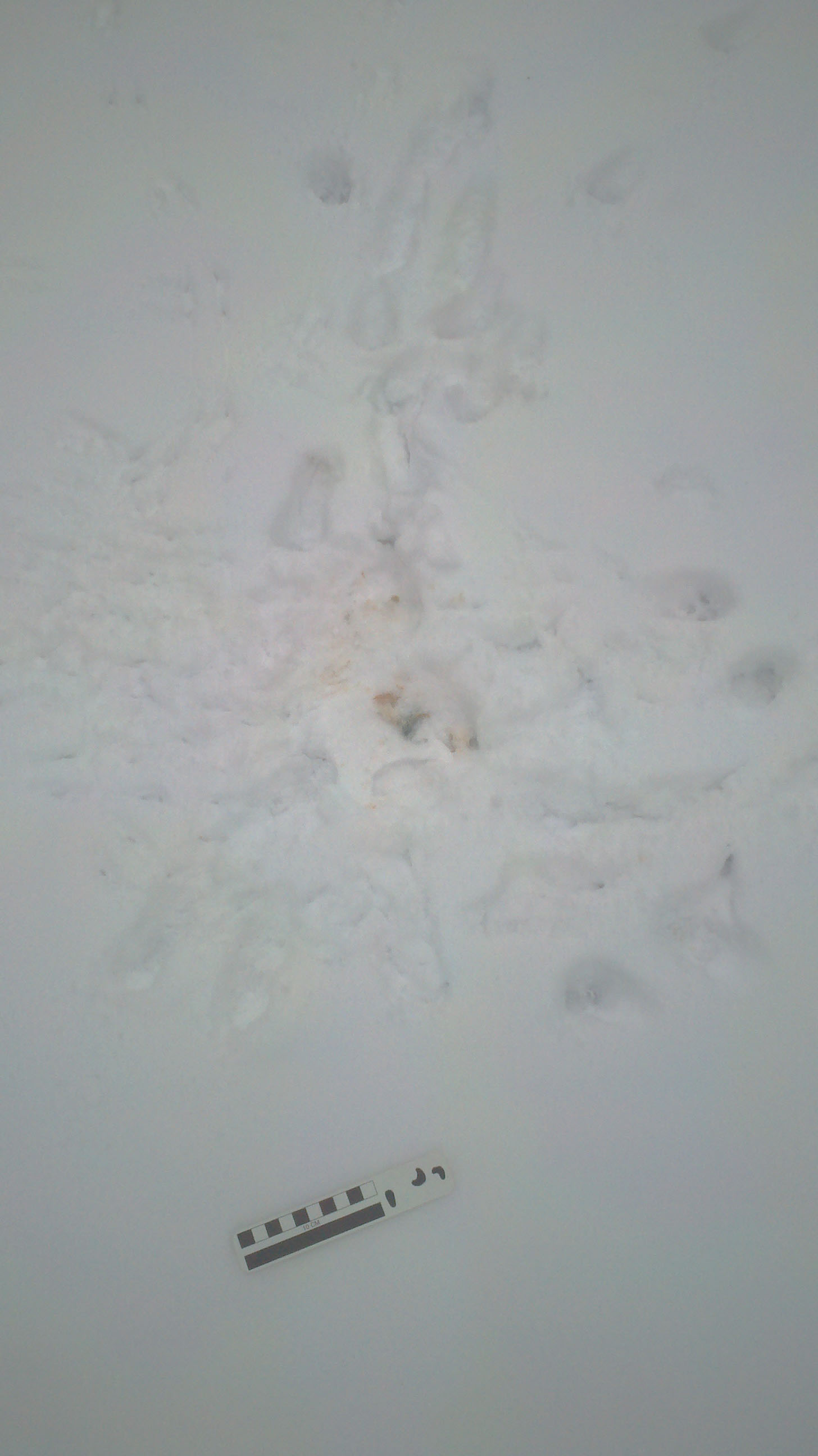
I have lost my muse today, so I just thought I’d post some interesting photos. This morning I saw a bunch of footprints in the snow in front of the kitchen window. Clearly something happened.
A flurry of footprints
Here’s a slightly closer view.
Closer up of the center of the action. I don’t know what’s in the middle there. I imagine it’s what’s left of someone’s dinner.
Here, I’ve labeled the tracks I recognized.
Some of the clearest tracks labeled.
The study of tracks and trackways left by animals is called ichnology. Yes, people make a career of this kind of work. So, put on your ichnologist hat. What do you think the story is here?
Comet, asteroid, and meteor impacts have been blamed for several of the Earth’s greatest extinctions, including the one at the Cretaceous-Tertiary (K-T) Boundary that led to the extinction of the dinosaurs (and later dominance of mammals). It’s only natural then, when an extinction is identified in Earth’s history, to take a moment and look for evidence of an impact.
The Clovis culture disappeared from North America about 9,000 years ago. That’s similar to when many of North America’s ‘megafauna,’ or giant animals, went extinct, like the woolly mammoth and giant ground sloth. For the extinction of the megafauna, most arguments hinge around human over-hunting or climate change, because that was about the same time that humans made it onto North America and it was also the end of the last glaciation.
There are some, however, who argue that an impact event caused the extinction of the megafauna and then also the demise of the Clovis culture. There was even a Nova documentary about it. Alas, the newest and best evidence soundly rebuts this idea. There are no impact craters from that time period (though it’s been argues that the comet hit the ice cap). There’s no shocked minerals either. Minerals take on the appearance of being disrupted (or shocked) due to the force of impacts. Shocked quartz is common from the K-T boundary event, but there is none associated with this 9,000 year old event. No impact occurred.
The downside is that we still don’t know what happened to the Clovis people.
The Beware of Movies! series is meant to point out some of the scientific inaccuracies of popular movies, specifically in points related to the geological sciences.
This post will point out the major inaccuracies portrayed in movies about climate change, and how it would affect the Earth.
Climate change is a sensitive topic. It’s become politically charged. It’s now taboo to talk about it in polite company. I’m not here to incite riots. I have my opinions that, though I won’t state them explicitly, they’ll probably be obvious. My objective here is to talk about how we understand climate change, how we can infer that it is happening. I want to demystify all the numbers and data points and graphics that we’re bombarded with every day.Continue reading “Beware of Movies! Climate Change”
Just when you start to think there’s nothing left for science to discover, they discover a new type of volcanic eruption.
There are two commonly-used categories of eruptions, effusive, when the lava flows calmly out of the volcano, and explosive, which is self-explanatory. Geoscientists have now added a new category to eruption types: tangaroan.
Tangaroan eruptions are slow and result in a very frothy lava to be released. When these eruptions happen underwater, the foamy lava (called blebs) floats up to the water’s surface.
How Tangeroan eruptions work
These eruptions are different than those that form the common floating volcanic rock, pumice, in that pumice is usually formed in explosive eruptions. This new rock doesn’t show the characteristic features of an explosive eruption. The new rock, and the new type of eruption, was clearly much slower than an explosive eruption.
Admittedly, I’m not a giant The Clone Wars fan, but I suspect at least a few of you are. And this is just too cool.
Umbraran Starfighters
In the Star Wars universe there are lots of interesting spacecraft. On first looking at the Umbraran Starfighter, Matt Wedel and Mike Taylor and at Sauropod Vertebra Picture of the Week (SV-POW), they suspected it looked a lot like the neck vertebrae of the long-necked dinosaur Apatosaurus (once incorrectly called Brontosaurus).
As it happens, they were absolutely correct. The concept artist (David Hobbins) took his inspiration from a displayed Apatosaurus neck vertebra back in 2007.
Not everything we learn about Mars needs to come from the fantastical rovers that are crawling over its surface. Some great new bits of information come from satellites orbiting high above the planet.
NASA’s Mars Reconnaissance Orbiter recently took some photos of the McLaughlin Crater. Close examination of the photos provided evidence that although now the crater is completely dry, it was once full of water.
McLaughlin Crater
In addition to giving detailed images of structures on the ground surface, remote imaging from satellites can also provide information about minerals present on the ground, based upon how the light is absorbed and reflected from the surface. In the case of McLaughlin Crater, there is evidence of carbonate and clay minerals which most likely would form in a lake.
The idea that there might have once been liquid water on Mars leads to the corollary that water must still be present on the planet. Scientists suspect that this water would be deep in the subsurface now. This, and all the other recent discoveries on Mars, leads scientists to believe that there Mars may have been habitable to life and my yet harbor life in it’s rocks.
There is a lot of discussion about climate change these days. It’s quite a polarizing topic, actually. It’s astounding to me to see how science – or a scientific result – is suddenly a taboo topic in polite company, just like politics and religion. It upsets me. Why are we not interested in the science? Why can’t I talk about it?
Well, I talk about it anyway, at least to those who are interested in listening. If people want to argue, then I usually shut down. It’s not that I don’t feel that such discussion isn’t worthwhile, and with some people I will try to be engaged, but honestly, most of the arguments stem from a fundamental misunderstanding of how science works and how scientists look at data. It’s frustrating, and it’s not something easily explained. There’s also a certain amount of mistrust of science, which I find disturbing.
Rather than trying to explain the entire body of climate science, perhaps I’ll take a moment to talk about one aspect of the climate debate. One thing that some argue is completely bunk.
The Hockey Stick.
Most everyone has heard of this. I’m not talking about the game of Hockey, here. I’m talking about the Hockey Stick. Considered by some to be the smoking gun proving global warming and by others as manipulated data. The gist of it is that if we can look at average annual temperatures over the last several hundred years, we see that there’s some fluctuations around an average, but that the last few decades have been getting warmer and warmer, more so than at any other time on record. This, then, is the rapid global warming that everybody is arguing about (but that you don’t talk about with your family at Christmas).
Well, where does this come from? When you see images of the Hockey Stick, you see time along the bottom and you expect to see temperature on the vertical axis, so that when the lines go up, you’re looking at warmer temperatures. What the vertical axis shows, however, is what’s called the “temperature anomaly” (although it is, at least, labeled in degrees). What the heck is that?
The temperature anomaly is the difference between any given year’s average annual temperature and the average of all the annual temperatures over a specified period of time (sometimes from 1951-1980, sometimes from 1902-1980, sometimes something else, always defined). During that span of time, temperatures were relatively constant. The decision to use this period of time as a baseline by which to compare everything else was arbitrary. (Or I assume, so. I wasn’t there when this decision was made!) The fact is, they just needed a ‘zero’ point against which to compare everything else. Presumably, records during that period of time were precise and accurate enough for the researchers to be confident in them.
PRECISION and ACCURACY: These are two terms that are sometimes confused for one another, but in science have very specific meanings. Accuracy is getting the right answer. It’s hitting the bullseye. In the case of temperature, it reflects how correct the temperature reading on any given thermometer is. Precision describes how well the same answer can be found. If you shoot ten arrows at a target, precision is about how close together those ten arrows are. In science, it’s about putting the same thermometer in the same freezer on different days and getting the same temperature reading, or perhaps putting ten seemingly identical thermometers in the freezer at once and seeing how similar all the readings are. Precision is shown on graphs (like the Hockey Stick) with error bars or confidence envelopes.
What’s important is to realize that something can be precise and not accurate and vice versa. I can shoot ten arrows at a target and they can all clump to the upper right of the bullseye, which I was aiming for. That’s precise, but not accurate. Or I can shoot ten arrows and have them spread out, surrounding the bullseye. In this case, they’re accurate, but not precise.
Precision and accuracy is a big deal in science, and particularly in climate science. Both of these are called into question when the legitimacy of the interpretation of the Hockey Stick is discussed.
In order to calculate a temperature anomaly, of course, one must first come up with a value for average annual temperature. For more recent years, this comes from instrumental records, aka, thermometers. One of the difficulties faced, however, is how to calculate a global average annual temperature, especially when temperatures vary all over the world, from day to day and season to season. And really, how can you compare annual temperatures in the arctic with annual temperatures on the equator? And then, throw on top of that precision issues with the thermometers themselves. Geez! How do you handle all those data?
Well, it’s complicated. The first thing you have to do is normalize everything. Normalizing means to set everything up onto the same scale so that they can be compared easily. This is where the temperature anomaly comes in. By using an average of a particular set of years and then showing all your annual weather data relative to that, it becomes possible to compare Arctic temperatures with equatorial temperatures. In the Arctic, a temperature anomaly of 1 degree might mean a change from -5 to -4 degrees, whereas on the Equator, it’s a change from 72 to 73 degrees. By normalizing using the temperature anomaly, we can easily see that the temperature went up one degree in both places.
The normalized anomalies can be averaged for specific regions (to help even out the differences between regions that have tons of thermometers and regions that don’t), and then for the whole world to get at a global temperature change. That’s what we’re really interested in.
When you calculate all these averages, you can also calculate the variation of the values. For example, in the Arctic, the anomaly could be 2 degrees, whereas on the Equator it could be 1 degree. You can calculate the average (1.5) but also calculate some statistics to represent the variation. This is where error bars come in. Your average is 1.5, but the range is from 1 to 2 degrees, so you draw a little bar on the graph representing that. (This example is not real, of course. Standard deviation or standard error would be used in a real scientific study, but you get the idea.) The error bars can also be extended (or shortened) depending upon the known precision of the thermometer used.
What you wind up with is a lovely graph of squiggly lines representing the global temperature anomaly over time. A positive anomaly means warmer temperatures than in times past. A negative anomaly means colder temperatures. The Hockey Stick shows warmer temperatures than in the past, and things seem to be getting warmer.
One of the problems with the typical image of the Hockey Stick, when it’s flashed up in the news is that it almost always lacks the error bars. The error bars are important. When looking at instrumental records (thermometers), for which we have data going back into the late 19th century, we can see that the error bars get smaller and smaller over time. This is due to improvements in the technology of temperature measurement. But the errors are still there.
Average global temperature anomalies.
Error bars give you a possible range within which the actual ‘real’ measurement might be. That is to say, that even though there’s a point on the plot, it might not be in exactly the right spot. The error bars give you a measure of how inaccurate the data point might be. It’s possible for data points to show a nice complex pattern, but to have error bars so big, that the pattern might not be real.
I like to think of error bars as bumpers. Imagine that you put a string into the plot between the error bars and pull it tight. If it can make a flat line between the error bars, then the data don’t show any pattern. If you pull the string tight and it still has bends and peaks in it, then those features probably represent true variations.
In the case of the Hockey Stick, the upturn of the temperature anomalies in the last few decades is pretty compelling. With error bars, the increase in temperature anomalies might be a little smaller, but it is still there.
Average global temperature from instrumental records. Colored lines show different possible rates of warming.
But what does this mean? We see an increase in the temperature anomaly over the last few decades, but really, this plot doesn’t look so much like the Hockey Stick you’ve seen elsewhere. The full-blown Hockey Stick goes back about 600 years, but we didn’t have thermometers way back then. How can we measure mean annual global temperatures from that far back.